|
|
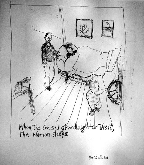
Post by Don Schaeffer on Nov 17, 2008 6:50:03 GMT -5
|
|
|
|
Post by Bernard Alain on Nov 18, 2008 10:04:44 GMT -5
I like this Don, the version I got in my email was much better, I think it was the shading from the light that created a feel of more depth ... dunno ... real nice.
|
|
|
|
Post by Don Schaeffer on Nov 19, 2008 10:29:10 GMT -5
Thnks Bernie. The pencil is hard to photograph.
|
|
|
|
Post by Bernard Alain on Nov 19, 2008 17:57:17 GMT -5
I dunno Don, I think the random light adds something to it (looks like darkroom dodging to me), I used to digitize my mother's pen and wash and send them off to Artek to be printed as giclees, there was shading on the corners and the guys at Artek would remove it from the final print, they always looked sterile by comparison, I thought that was a mistake, even though it wasn't the same as the original.
|
|
|
|
Post by Don Schaeffer on Nov 20, 2008 8:16:00 GMT -5
Thanks Bernie. I don't like the uneven background but can't help it. The lines are much deeper in this though.
|
|